Depending on your gender you’ll call it one or the other. I’ll leave it to you to figure out which is which. 🙂
Anyway, I just did one or the other to my own website. When you rush to the home page you will see that the visual design is completely different (assuming you’ve been to this site before – if not you can see examples of websites we’ve redesigned on the Before and After Websites page).
Okay, so the look has changed a lot, but that’s just what you see at a glance (and the way many people judge a website). But I actually also did an architecture, content and navigation overhaul makeover. I cleaned things up; made the site and my message more focused and succinct; deleted or moved content that made the site too busy; added new content – an FAQ page; and on and on.
I could just call it a redesign but to me that sounds like I just changed the colors, layout and graphics. Plus I’m still not sure if it’s redesign or re-design. I like it better with the hyphen. I think it helps clarify it and is easier to read. I Googled it and it seems to be used both ways.
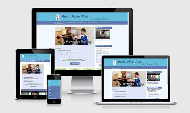
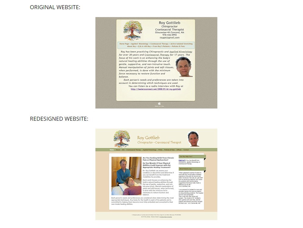
Anyway, I now have a nice way to feature my portfolio of websites. The irony is that the portfolio gallery shows an image of each site – so you get the superficial visual appeal thing that I am always complaining about. Not that I don’t like it but a website is so much more than a pretty face!
So….you can see the website’s glamour shot, but you can also visit the actual site…thank goodness. And I included a description with each site about its features and challenges. So the ability to visit that actual website enables folks to experience it in all its glory.
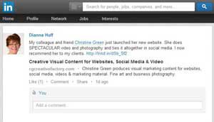
I have to say I find it irritating when I view the online portfolio of another web designer and all they show you is a screenshot rather than the live site. So then I have to copy or dig to get the real URL and type it into my browser so I can see what they actually built. I can understand not wanting to include the live link because God knows what some people will do to their sites after we cut them loose. And of course the viewer will assume the web designer is responsible for the added junk or weird font.
Well, I suppose all this rambling is my way of announcing that I have re-designed, overhauled, and downright made-over, my website!
I hope it’s a better experience for my visitors and offers a clearer message about what we do and how we can help small businesses. I have combed through it but if you find any typos, I’d appreciate a shout.